UX Design — Internship Project
Leimo- wear more of what you own
Helping you rediscover your wardrobe — and reducing fashion waste one outfit at a time.

"Most people don't have a clothes problem — they have a creativity and time problem."
The problem.
Fast fashion habits leave wardrobes full of underused clothing. People buy new items for each occasion rather than restyling what they already own — a pattern driven less by need than by emotional buying, aspiration, and the pull of sales and constant new releases. Women — especially students and office workers with little time — are particularly prone to this cycle, often keeping unworn pieces out of guilt rather than discarding them, which only deepens the "nothing to wear" paradox despite a full closet. Unused clothes eventually end up donated or thrown away, contributing to significant textile waste.
Leimo aimed to solve this by letting users upload their wardrobe, style existing items into new outfits, and optionally consult with fashion designers for personalised guidance.
The opportunity
Leimo reduces that cognitive load. Upload your wardrobe once, and — when you want a real second opinion — consult a professional designer on your terms and budget.
User Research
Two people drive every decision.
M
Maya, 26
Marketing coordinator, Bengaluru
"I have a full closet but still feel like I have nothing to wear on Monday mornings"
Pain points
Decision fatigue on busy mornings
Buys similar pieces repeatedly
Forgets items stored out of sight
Goals
Wear more of what she owns and feel confident without effort
R
Rahul, 34
Product manager, Mumbai
"I want to dress better but I don't know where to start - I need someone to just tell me what to do"
Pain points
No eye for combining pieces
Doesn't trust algorithm-only advice
Unsure about fit and styling rules
Goals
One session with a real designer and a clear, repeatable style system

Key screens
Design decisions, annotated.
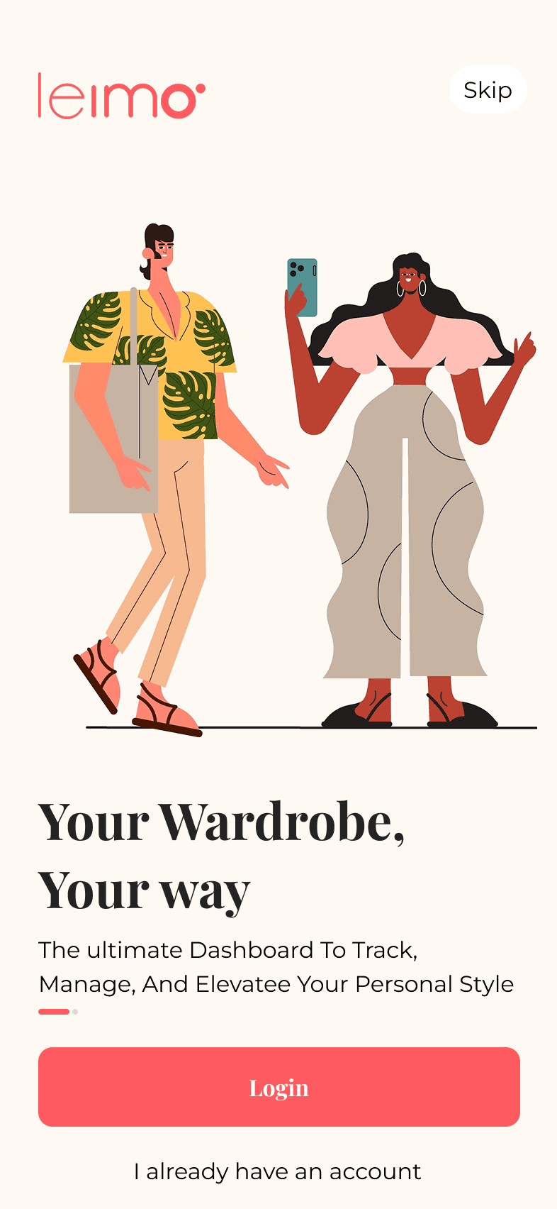
My Role
As the sole designer at this early-stage startup, I functioned as the full design process - from intiial audit and user research through to wireframes, the final UI design, and prototyping - while reporting directly to the founder, Palak
Key screens
Discovering the gaps
After reviewing the existing product, I identified two key areas where users were struggling.
Unused Onboarding Data
The application collected information such as body type and style preferences during onboarding, but the data was never used to personalize the experience.
This represented a missed opportunity to provide immediate value and encourage repeat engagement.
Hesitation Around Designer Sessions
Users viewed consultations with fashion designers as occasional luxury services rather than an accessible, ongoing resource.
The platform was not effectively communicating the value of professional guidance or lowering the barrier to booking a session.
Key screens
User Insights
Through interviews and feedback sessions, several recurring themes emerged:
Users struggled to make use of clothing they already owned.
Many expected outfit recommendations without having to manually build outfits.
Designer consultations felt intimidating or expensive.
Users wanted more guidance and validation while styling themselves.
People needed a reason to return to the app regularly.
Key screens
Design Process
Feature Breakdown
Each proposed feature was treated as an independent user problem before considering overall screen layouts and interactions.
Rapid Exploration
I used the Crazy 8s ideation method to quickly explore multiple concepts and identify the strongest solutions.
Wireframing
Promising ideas were translated into low-fidelity wireframes and reviewed collaboratively with stakeholders.
Prototyping
Selected concepts were developed into interactive high-fidelity prototypes for usability testing and validation.
Key screens
User Insights
Through interviews and feedback sessions, several recurring themes emerged:
Users struggled to make use of clothing they already owned.
Many expected outfit recommendations without having to manually build outfits.
Designer consultations felt intimidating or expensive.
Users wanted more guidance and validation while styling themselves.
People needed a reason to return to the app regularly.
Key screens
Key Design Decisions
Personalized Style Recommendations
I leveraged onboarding data such as body type, style preferences, and skin tone to generate personalized daily fashion suggestions.
This transformed onboarding information from passive data collection into an active engagement tool and encouraged users to return to the app regularly.
Tiered Designer Consultations
Instead of offering a single consultation option, I introduced multiple session lengths ranging from short consultations to more comprehensive styling sessions.
A rewards-based system reduced the psychological barrier to booking and encouraged first-time users to engage with professional designers.
Stylist-Curated Wardrobe Directory
Designers could recommend products directly through the platform.
Purchased items were automatically added to a user's digital wardrobe, creating a seamless connection between recommendations, purchases, and outfit creation.
Clear Labels and Guidance
To improve accessibility and usability, every action included clear labels and supporting text.
Avoiding icon-only interactions reduced ambiguity and helped users navigate the application with greater confidence.
Key screens
Outcomes
These design decisions were aimed at increasing daily engagement through personalization, lowering the barrier to a first consultation booking, and improving navigation clarity. As an early-stage concept, the natural next step would be usability testing to validate these against real user behaviour.
Key screens
Reflection
The project evolved significantly from its original concept.
While the initial product focused heavily on a drag-and-drop outfit builder, research revealed that users were looking for guidance rather than more manual effort.
If I were revisiting the project today, I would further explore AI-powered outfit recommendations and intelligent wardrobe insights, helping users discover outfit combinations automatically rather than building them manually.
One of the biggest lessons from this project was that the most impactful features are not always the ones users explicitly request—they are often the solutions that remove the underlying problem altogether.